Saturday, February 27, 2010

20/10


I've swear I've watched her music video 20 times today and it will be a miracle if the song ever leaves my head. I'm still trucking away on the logos trying to draw inspiration for album covers and what I have of her notes. More to come.

In the true spirit of 20/10 I found this from the NYT and thought it was interesting. I wish they would have put who the designers were for them. I would have liked to see if anyone person did more than one logo.

http://www.nytimes.com/imagepages/2009/01/28/sports/28logos_gfx.html. I thought Erica, the sports page designer would like these.

As for the our real logos I was really impressed that we were all over the board as far as interpreting designs. I cant say I didn't work on the 20 but I think the five I really execute well will be much more impressive. Can't wait to see what she picks. I think we'll all be surprised. The one I liked the best didn't make anyone's favorite's list. The L with the little purple heart. Im going to try and revamp cause Im not ready to let it go. I think it was because I was so bored with all the other ones because they were all so similar I just liked it because it was different. I felt really inspired after seeing everyone's work. Some of these I really hate but I know I can improve them.

Project M. 2.27.10


Grill n' Thrill

In a 4:30 group presentation team CookOut really did well. Trying to keep in mind the publishing groups ideas and mission statement in mind.

I wont go too much into their specific concepts for the magazine but these are my pages.

Erica and Sarah really knocked it out of the park with their designs. I think our finished product with all of us working together will be a fantastic portfolio piece.

Wednesday, February 24, 2010

You Cant Miss This

I know all of our brilliant ideas will be something that other designers won't want to miss. This was such an awesome project to showcase our ideas. I hope that everyone posts pictures of what they come up with. I know I will when after 4:30 tomorrow.

February 24 Response Portfoilio review and Meredith.

I cant wait to get all your reviews back. I was really dreading setting all my stuff out like that but I think in the end it was really helpful. I know you all felt the same way because of the thoughtfulness I saw each person putting in on every critique.

I was really impressed by how diverse everyones portfolios and started to feel bad for anyone applying for the same job as one of you all! There was everything from Bre's cool letter presssings and Steph's billboard.

There were pieces from some amazing internships that design students would kill for!

I can't wait to see what Thursday's portfolios will hold.

This week we also met with Jan to discuss options and more in depth portfolio pieces. I know i need to start including more and redoing some of our previous projects. But that will have to be at a later date. I really felt refreshed after our little meet and greet. I got to explain a little of my extra curricular activities (ie my little hiatus at home and my double major) I think revealing a little bit more about me really made me feel more comfortable overall. It felt like a new start in the class. There is a lot to do every week but I feel like I can handle it all now. I also gave up breakdowns/being overwhelmed for lent so I'm practicing a one thing at a time mentality. Let you know how it goes.


As you all know our Meredith presentations are tomorrow and I'm excited about my concepts but I know that my groups ideas will be incredible. Sarah and Erica are very talented.

Wednesday, February 17, 2010

You Can't (and don't want to) miss this.


http://www.starbucksloveproject.com/

I've discussed my success in Flash but it's nothing compared to this site that Starbucks put together. So ignore the sponsorship if that bothers you, and appreciate the message. Think about the Flash lessons we've been getting and laugh because making boxes is a long way from this. It's a level of Flash that I know I aspire to be at some day.

Response Feb 17th.


I can't beleive it's the middle of Feb already. Where did the time go?

This is the cover I settled on to present. Not to much to say really, It just wasn't what they were looking for. After I printed it out for the presentation I saw some typography issues that I wanted to address. I'm looking forward to the challenge of another cover or feature assignment. I feel like the discussion about voice we had in our staff meeting Monday was a reminder of the whole point of being here.

I also spent this week putting my art on the server. Images to come after they've been published. Thanks to Elise, I learned a boat load about illustrator. Illustration to come as well as final version of illustration map. SO GET EXCITED.

Critique 2.17.10


I just want to begin this critique by saying I'm not an alcoholic and I don't have a problem but 1 parts whiskey to 3 parts diet coke is a God send for a stressed designer. AKA me. It is my goal to just share the little tid bits that keep me going in the hopes to keep you all going. Maybe by the end of this semester we can make a class cocktail recipe book. Thoughts?

Flash CS4. I am by far not an expert but after being up in my ears to action script and buttons, I feel like I learned a lot. This may be nerdy but I completely over estimated/forgot the usefulness of text books. It's been so long since I've used on for a paper or to figure out a soluton to a problem that I felt like a real live student this week. Check out the link to see it all in action.

http://www.voxmagazine.com/stories/2010/02/18/getting-your-fix-columbia/


I'm happy with the way it turned out, but I had a lot of ideas but wasn't sure how to execute them. Lots to learn...

You all should probably check it out cause I did this one (practically) all on my own
(Thank you Kristin Kellogg, Ric Wilson and text book)


NIFTY FIFTIES
Presentations were pretty cool. I learned a lot about this history of a few magazines but there are so many to cover that it's impossible to go over them all. I love the images and colors from the 50's. It wasn't until last night I remembered how fast I've gotten at writing. Hopefully that impresses an employer someday. I wish I would have picked a more visually interesting magazine like Vogue or Ladies Home Journal. The New York Times is steeped in tradition but not the visually inspired tradition of scandalous art directors or stories of defeat.

Wednesday, February 10, 2010

Feb. 10 Critique


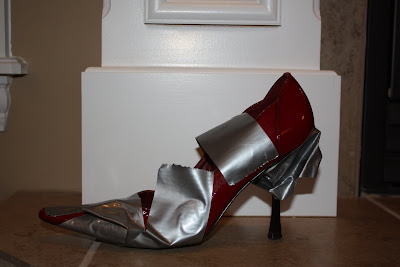
Photos of first draft of duct tape cover to come. Followed by photos of second draft of duct tape cover after class critique tomorrow. I created my first photo shoot. Not knowing anything about lighting, I used industrialized sized duct tape, and borrowed shoes. I realized the only heels I own are black brown and blue. Talk about boring and inconvenient.

This is just a little preview of the photos I took! Im a pro (ha)

Response Feb 10th


Whoa Baby....does anyone else feel a little behind? I think after designing so much between my two classes, Im starting to feel a little worn.

As nerdy as this sounds I felt a tad more inspired after watching the Helvetica movie. I thought of lots of little idea that I tried to scribble down on the post-its in front of me. In true designer fashion I had so many ideas and so little place to write that I couldn't really read them later. It was nuts to see how one typeface inspired and changed so many designers. The movie was long but there were a few times I looked over at Jan and she looked like a little kid in a candy store. Priceless. After class we had some designer-designer bonding time when I drove Julie and Jessi home. WAY to cold to walk. We should come up with a car pool.


Im ready and have been thinking about the Meredith project meeting tomorrow. It will be interesting to see what everyone comes up with.

This past week I was responsible for three concept covers. One of which I thought had a good concept but was executed poorly. The idea that duct tape is a universal fix, I thought was brilliant (If I do say so myself.) I'm starting to worry that all my covers look the same. I don't know if I can attribute that to 'my personal style' or that I just need to work on evolving my designs.

Also in my to do list was making sure the art for 2/18 was on the server. And don't forget the Multimedia Leap Pages due Sunday! I'm not complaining.

Feb 10 You Can't Miss This


This week I created an 'info graphic type' map but was uninspired by the limitations. The feature was on getting your taxes done and the map was just where those places were. I mean, how many ways can you think to do a map. MANY. I found this typeforyou.org.

It's a pretty awesome example of information plus design. Just makes me wonder how far we can go on deigns for Vox. If a simple gird map of Columbia and something like this would be just as acceptable, if not better.

Wednesday, February 3, 2010

You Can't Miss This

http://cameronmoll.com/archives/2010/01/colosseo/

This is a great example of what travel and foreign countries can do to the imagination. I've been lucky enough to have traveled abroad twice and always return home inspired but never do anything worth while with the images I leave with.

This guy's awesome. Check out what he does with the Colosseum.

Reponse: Week Two

I missed the client meeting with Laura Bell Bundy: Fail. This week I've had some family things going on and had to drive home. I'm excited to start designing the logo and I hope to God it's not due tomorrow because I'm behind enough for this week as it is!

Critique: Week Two

This week I had my feet planted on the ground and gave myself enough time to finish my designs. This assignment was to design a spring cover and feature calender for the 'Spring Preview' issues of VOX. In doing this assignment I thought of everything that had to do with spring: flowers, rain, new growth ect... then I tried to design the cover in a way that incorporated the idea of spring but not in a way that everyone thinks about it. I chose the rain boot. In the critique this week Prof. Rowe and Co. said the cover looked flat and I agree. In what I call an execution error I sleep better at night blaming my photo shop skills than my ability to see that the image of the boot needs a shadow. I stick by my idea of using the boot instead of flowers or the sun or actually rain drops.

In the critique my use of typography was also mentioned. I put a lot of time into picking the font and placing it over the boot. I guess it's just going to take more time to master the art of Typography. :)


THE FEATURE:

I was proud of the feature because I got a compliment on it and it was the thing I put off doing. It was clean and had a fair amount of white space which seems to be my style. Prof. Rowe pointed it out as being a design she liked, WAHOOOO.